
Bellari Home
Remodeling
Applebee’s
and Mint had
a mutualistic
relationship in
2016 – 2018.
At that time, Applebee’s gift card and carrier were charcoal and brick red — two colors that had been adapted from a previous style guide, and had a textural focus. One of the new objectives from the Applebee’s team was to incorporate more of the current logo colors, and to spotlight the apple imagery that is such an iconic part of the brand.
The redesign of the Applebee’s gift card carrier takes full advantage of the bright, bold brand colors and apple imagery. It’s clean, thoroughly branded, and easy to identify on a crowded shelf.
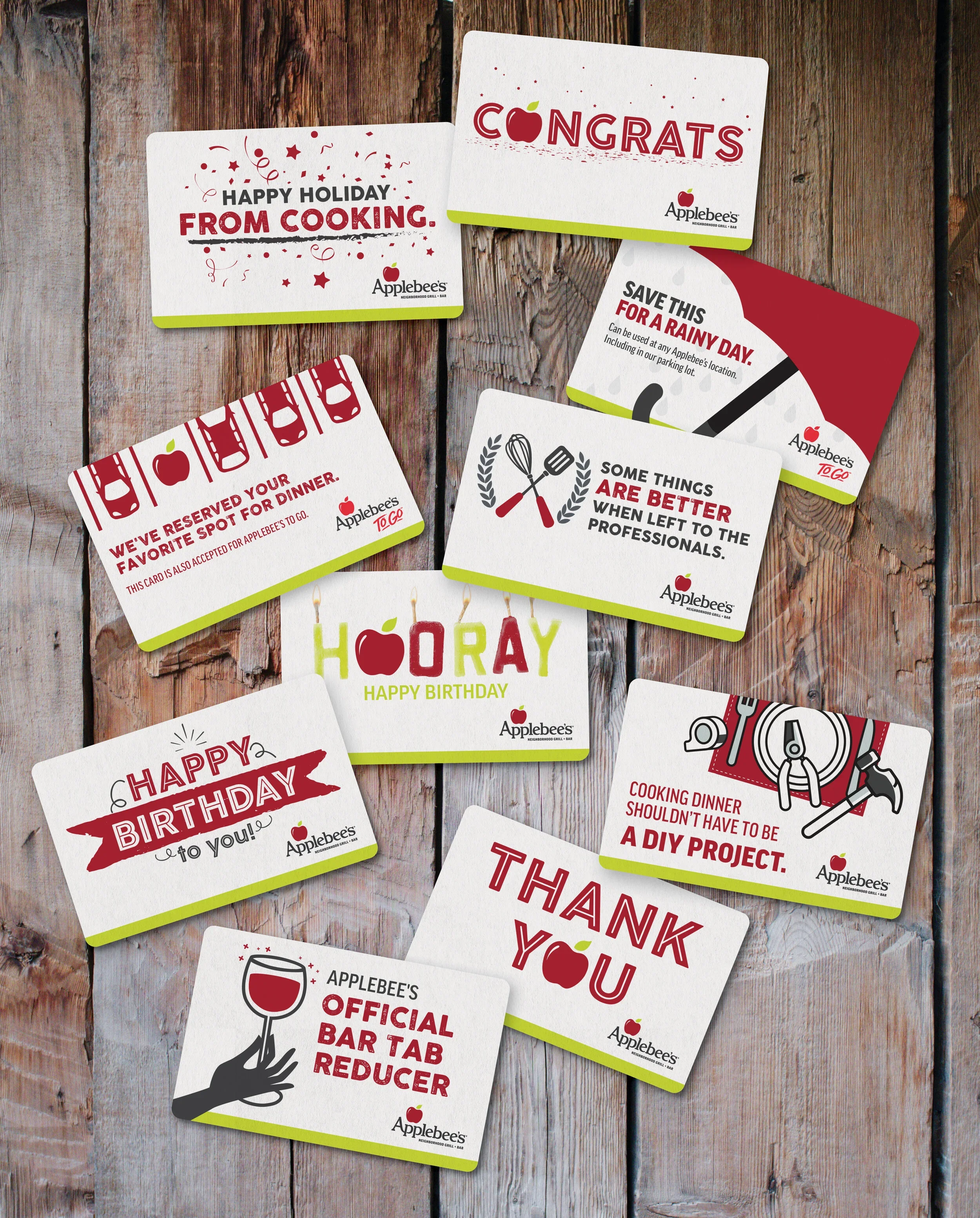
After the development of their new Everyday Gift Card, Applebee’s wanted to explore a range of printed and eGift cards that celebrated a variety of special occasions. Our group objective was to make these cards feel consistent with the recently rebranded elements.
We focused on the apple imagery and moved away from all textural and food photography themes, relying on a clean graphic focus and the red and neon green Applebee’s colors to guide the art direction.
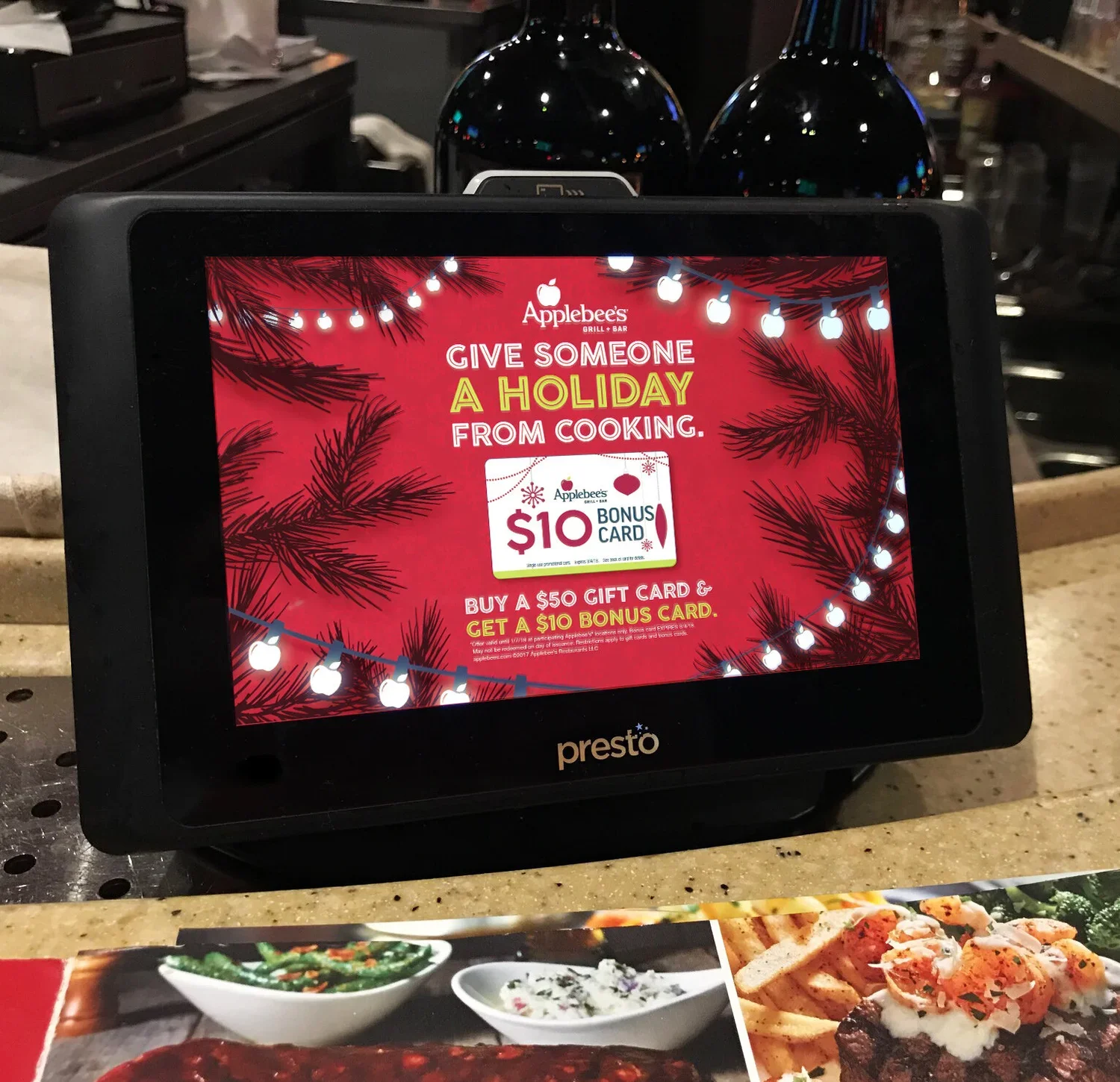
2017 was the first year that Mint Advertising had the opportunity to design Applebee's Holiday POP, a nation-wide marketing program to promote gift card purchases. By our conclusion, Mint had created over eleven pieces of collateral that were showcased in Applebee's stores in the month of December.
It was important to Applebee's that the look and feel for this project was ownable. We were encouraged to inject our designs with branded elements, which is why you can find the Applebee's apple appearing as holiday lights in the final creative. The initial concepts presented represented the general festivity of the holiday season without being exclusive to one celebration over another.
The final design concept was widely adapted for a variety of media: TV screens, table tablets, standalone displays, menu inserts, table toppers, window clings, and more.
Ultimately by bringing in the iconic Applebee’s red and apple emblem, we were able to refocus consumers on the very recognizable, all-American brand in their neighborhood.
You see, Applebee’s needed new Point of Purchase printed materials, like gift cards for general use, occasions, and holidays. And Mint? Well … we wanted to design fun stuff.
At that time, Applebee’s gift card and carrier were charcoal and brick red — two colors that had been adapted from a previous style guide, and had a textural focus. One of the new objectives from the Applebee’s team was to incorporate more of the current logo colors, and to spotlight the apple imagery that is such an iconic part of the brand.


Creative Director: Billy Joe Pyle
Copywriter: Tony Lamont